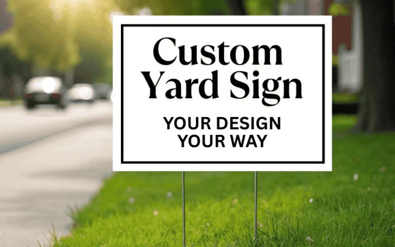
Yard signs are a tried-and-tested way to attract more customers. Whether you are promoting an event or your products and services, a great yard sign can grab attention.
However, it can only be effective if you are designing them right. To get the best results with yard signs, there are a few dos and don’ts you have to follow. We are going to list them in this blog.
Dos of Yard Sign Printing
- Keep the Message Clear and Focused
Custom yard signs just have a few seconds to communicate its message. People walking or driving by are not going to stop and read long sentences. Thus, clarity must be your priority. Concentrate on one primary message. This can be your service or a promotion. Keep the message short and direct so it can be understood instantly. Don’t be tempted to add too many details. Including long descriptions or multiple services can make the yard signs printing look cluttered. This can make people ignore it altogether.
- Use Bold and Readable Fonts
Font choice plays an important role in readability. Your text must be easy to read from a distance, even at a glance. Simple and bold fonts work best because they maintain clarity in different lighting and viewing conditions. Make sure there is enough spacing between lines and letters to improve legibility. The goal is to make reading effortless. Avoid choosing script or decorative fonts. Even though they appear attractive, they are often difficult to read.
- Use High Contrast Colors
Color contrast is important for visibility. A strong contrast between the background and text ensures the message on the yard sign stands out. For instance, a dark text on a light background or light text on a dark background works well. Using the brand colors is essential, but they must not compromise readability. Adjust shades if required to maintain clear contrast. Avoid color combinations that blend into each other or are hard to distinguish. Poor contrast can make the sign difficult to read.
- Add a Clear Call to Action
Your yard sign must guide people on what to do next. A clear call to action will help turn attention to action. This can be visiting your store or calling your number. Keep the call to action direct and simple. It must be easy to understand and act upon immediately. Don’t miss out on the call to action or include one that is vague. If your target customers do not know what step they should take next, they are less likely to engage with your business.
Don’ts of Yard Sign Printing
- Mixing Confusing Design Elements
Consistency in branding enables people to recognize and remember your business. Use the logo, brand colors, and tone consistently across your yard signs. A cohesive design on yard or custom magnetic signs can create a professional look and build trust over time. When people come across your brand repeatedly, they must associate them with your brand instantly. Don’t mix too many styles, fonts, and colors. Inconsistent designs make the signs look unprofessional.
- Let Them Be Outdated
Yard signs are more effective when they are fresh and relevant. Updating the signs for seasonal promotions or events keeps the message interesting. Also, regular updates help grab attention from people who pass by frequently. A new message or design can make them notice the sign again. Avoid keeping the same sign in place for too long without updating it. With time, people might stop noticing it, reducing its effectiveness.
- Choose Fancy Script Styles
The font you should use for your yard or magnetic signs printing must be easy to read from a distance. Clean and bold fonts help your message stand out. It ensures your target customers can read it easily, even while moving. Avoid script or decorative fonts that might look stylish but reduce readability. In case people are struggling to read the yard sign, they will simply ignore it.
- Fill Every Inch
Proper alignment gives your yard sign a professional and clean look. When images, text, and other elements are well-organized, it becomes easier for the viewers to read and understand the message. A structured layout guides the eye naturally from one part of the sign to another. It ensures that the most important information stands out. But if the layout is messy, it can confuse viewers and make the sign look unpolished. When graphics and text aren’t aligned well, the design feels chaotic and difficult to follow. This can reduce the overall impact of your message and make your business appear less professional.