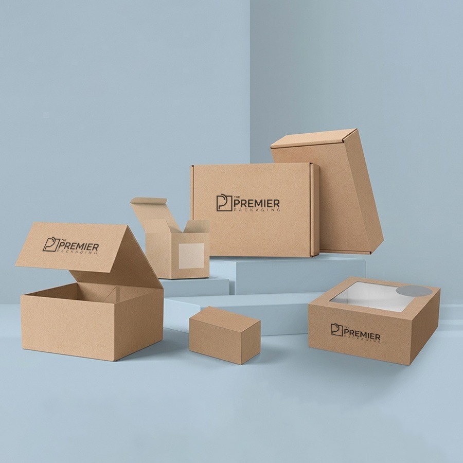
There’s a moment that happens more and more at checkout counters and on doorsteps everywhere someone opens a package, and instead of glossy foil or bleached white board, they find plain Kraft. No shouting colors, no over-the-top branding. And somehow, that plainness reads as more trustworthy, not less.
That’s not an accident. Kraft packaging has quietly become one of the clearest signals a brand can send about what it actually values, without saying a single word.
Why Plain Reads as Premium Now
For a long time, packaging design worked on the assumption that more was better more color, more shine, more visual noise to grab attention on a crowded shelf. Kraft boxes flip that logic. They lean into texture instead of gloss, and into restraint instead of volume.
Part of this is just consumer habit shifting. People have gotten used to seeing recycled-looking material and reading it as a shorthand for “this brand thought about where its packaging ends up.” Whether or not the box is technically more sustainable than a glossy alternative, the visual language of Kraft paper carries that association almost automatically.
There’s also something to be said for how well Kraft ages visually. A white box that’s been handled a few times starts to look worn. Kraft just looks like Kraft a little wear doesn’t undercut the aesthetic the way it does on a glossy finish.
What’s Actually Under the Surface
The material itself is usually unbleached or lightly processed paperboard, which means fewer chemicals go into making it compared to bright white stock. That lower processing footprint is a real difference, not just a marketing story, though it’s worth being honest that Kraft alone doesn’t automatically mean fully recyclable or compostable that depends on the coatings, adhesives, and inks used on top of the base material.
Printing on Kraft also behaves differently than printing on white board. Colors sit a little muted, which forces a kind of design discipline a single spot color or a simple line illustration tends to do more work on Kraft than it would on white, because there’s less competing with it.
Structurally, Kraft holds up reasonably well for its weight, especially in corrugated form, which is part of why it shows up so often in both shipping and retail-facing packaging. It’s sturdy without needing to be dressed up.
Where It Actually Gets Used
This is where the material earns its reputation as more than a shipping default. Brown Kraft Retail Boxes have become a common sight on shelves for everything from specialty food to skincare to small-batch goods, precisely because the plain material does a lot of the brand storytelling on its own. A minimal Kraft box with one well-placed logo can sit next to a shelf full of loud packaging and still stand out, just by being the quiet one.
Food brands lean on it especially hard, since Kraft is associated with “less processed,” which pairs naturally with ingredient-forward products. Skincare and wellness brands use it for a similar reason it signals restraint, which people tend to associate with honesty about what’s actually in the product.
The Trade-Offs Nobody Skips Past Fast Enough
- Limited print detail Fine gradients or photo-quality images don’t translate well onto uncoated Kraft. The fibers absorb ink differently than a coated white surface, so anything relying on sharp detail usually needs a different substrate or a partial white coating, which chips away at some of the cost advantage.
- Not automatically cheaper A plain Kraft mailer is genuinely inexpensive, but that changes with finishing. A Kraft box with foil accents, a custom die-cut, or a printed interior can end up costing about the same as a fully coated box, since labor and tooling costs don’t drop just because the base material looks simpler.
- Sustainability only holds up end-to-end A Kraft box wrapped in plastic tape and stuffed with non-recyclable filler undercuts the whole point pretty quickly. Customers notice that mismatch more than brands sometimes expect.
Final Words
The brands that use Kraft well tend to treat it as a design constraint rather than a default. They pick one or two print colors and commit to them, rather than trying to force a full-color design onto a material that resists it. They pair the box with compatible fill and tape rather than treating sustainability as something that stops at the outer layer. And they use the natural texture as part of the design instead of fighting against it with heavy coatings that erase the whole reason someone chose Kraft in the first place.
Done well, a Kraft box doesn’t need much else to make its point. The material is already saying most of what needs to be said that the brand behind it thought past the sale and cared enough to make even the packaging match that.
